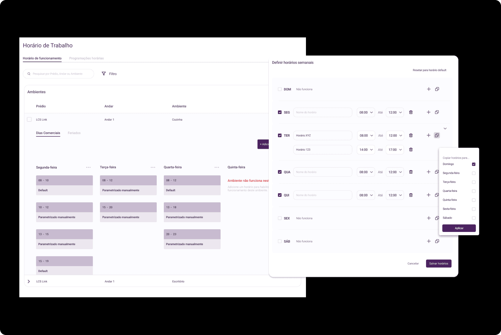
Monitoring and analysis of operations in the industrial environment

ROLE
UX Designer
TIMELINE
6 months
KEY ACTIVITIES
— Tests and Validation
— User Research
— Nielsen's heuristics
— Prototyping
Overview
The main goal of the Moka IoT application is to streamline the control and monitoring required by operators in industrial environments.
What are the main usability issues that users are facing? What are the main goals of the platform and how are they aligned with the users' needs? Who are the target users of the platform and what are their characteristics and specific needs? What are the most common tasks that users perform on the platform and how are they currently being executed? What are the most significant pain points that users encounter when using the platform? How is the current navigation structure organized and how can it be improved to facilitate the location of information and functionalities? What are the best practices in user interface design and how can we apply them to enhance the overall user experience? What are the users' expectations regarding the platform and how can we exceed them to provide a more satisfying experience?
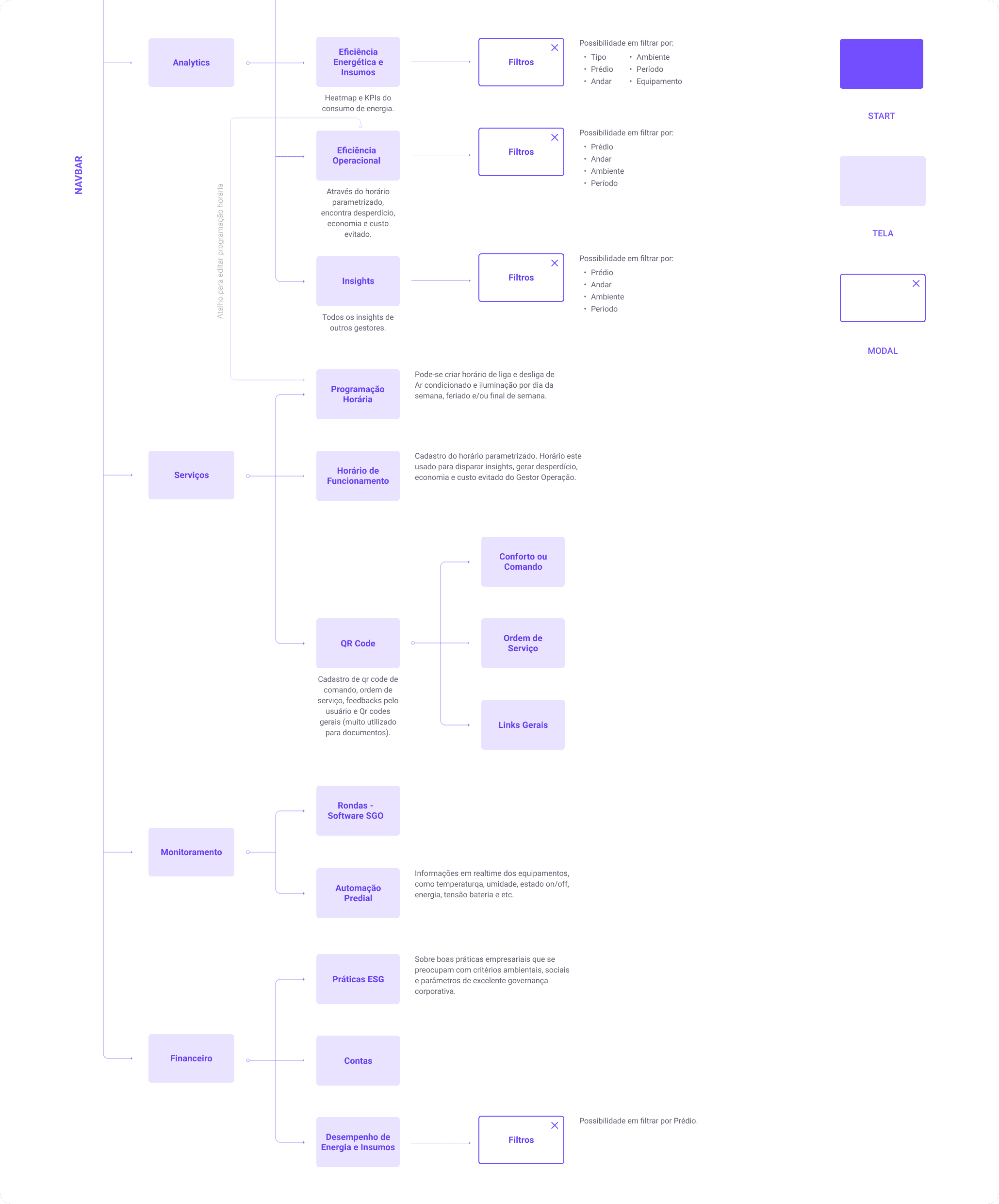
This project began with dozens of questions to truly kickstart the redesign process aimed at enhancing the platform's usability.
Challenges
Current design is confusing
Moka building tool complexity
Each persona has a unique need
Improve brand feedback
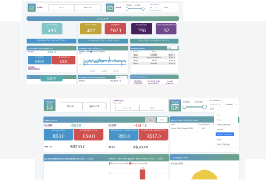
Research and usability testing
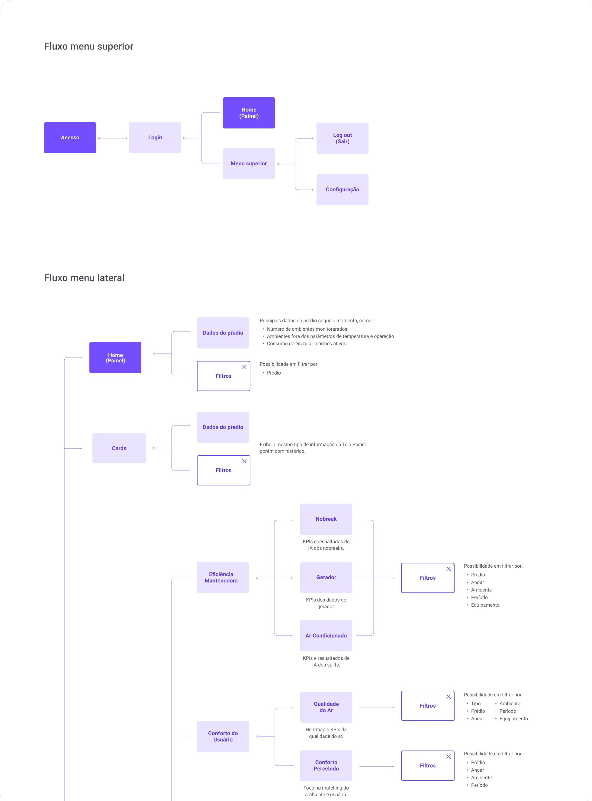
After conducting a survey with platform users, it was identified what they expect from it and which functionalities they use the most on a daily basis, as well as their difficulties in navigating and locating specific resources on the platform.
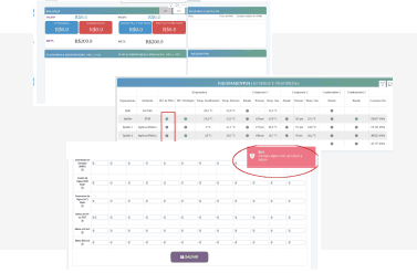
I conducted an assessment on the platform based on Nielsen's 10 heuristics. As a result, I identified areas for correction and improvement regarding seven aspects addressed by these heuristics.
Usability Heuristics
The identified points are associated with the following heuristics:
Visibility of system status
Correspondence between the system and the real world
Consistency and standards
Error prevention
Recognition rather than recall
Flexibility and efficiency of use
Aesthetic and minimalist design
Impact
1.59
minutes for users to complete their tasks, which before was 5 to 6 minutes
5/5
Rating with customers after launch, with several positive mentions
Prototyping
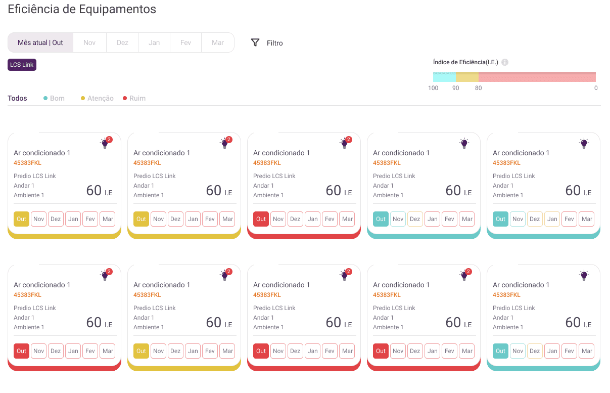
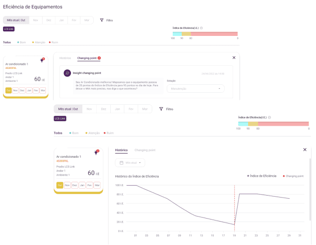
I developed a pattern for all screens with self-explanatory elements. Now it's possible to interpret the graphics without confusion of information and colors, as well as establish a clear visual hierarchy.
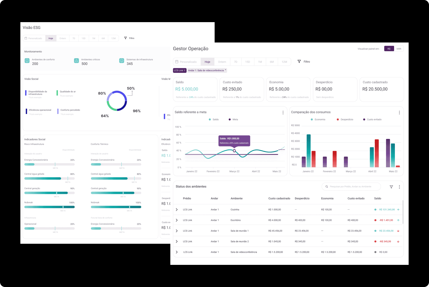
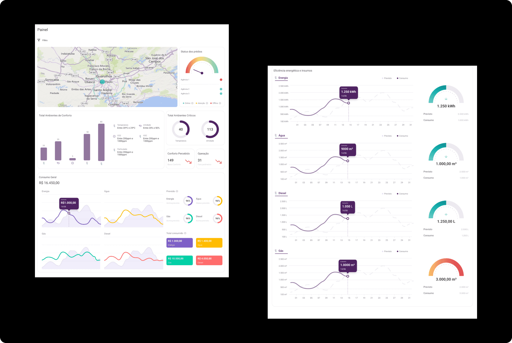
Each color in the graphs has a specific meaning, making the interpretation more visual and quicker than a table listing all the information.
Now, performing actions within the platform has become simpler, allowing for continuous visualization of specific data. Additionally, copy elements have been introduced to streamline the process and avoid keeping only fixed information, as editing is possible.
