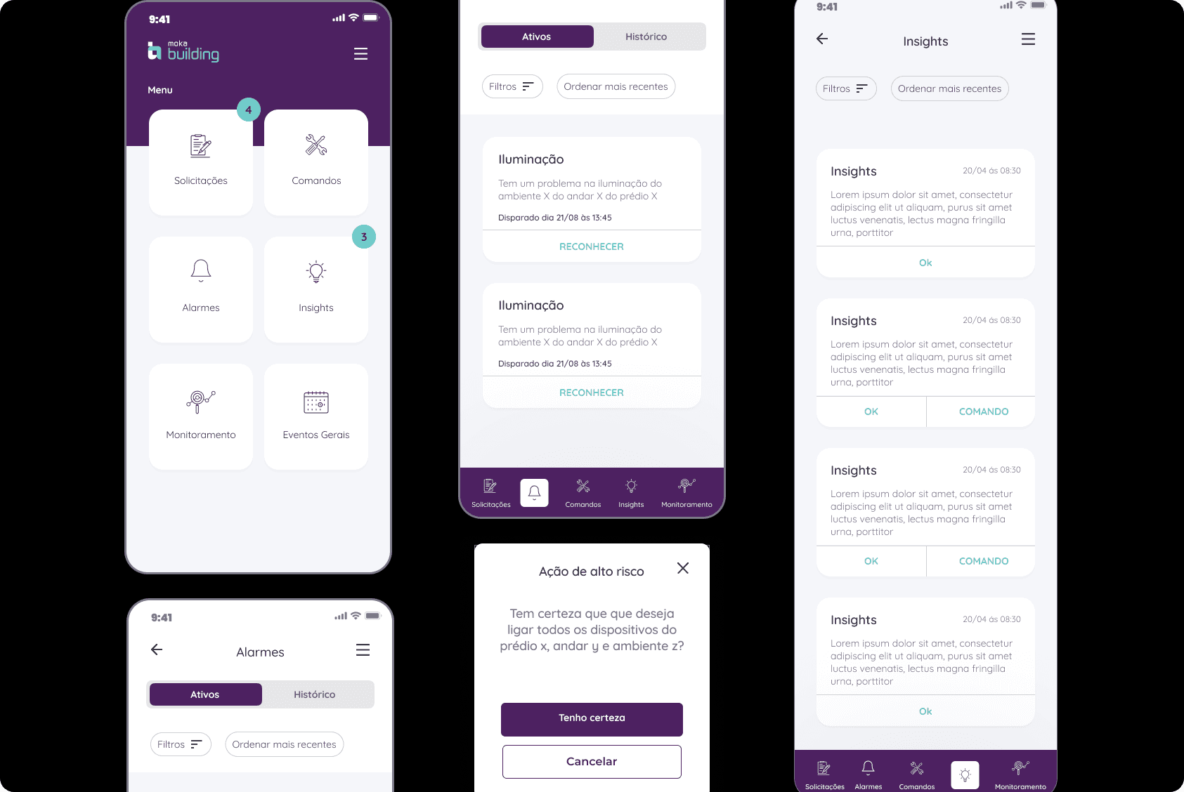
Facilitating the monitoring of operations in the industrial environment.
ROLE
UX Designer
TIMELINE
2 months
KEY ACTIVITIES
— Tests and Validation
— User Research
— Visual Design
— Prototyping
Overview
The main goal of the Moka IoT application is to streamline the control and monitoring required by operators in industrial environments.
How can we enable communication with building operators when they are not in the building's general system? Can we enhance this communication channel using an accessible, responsive, and easy-to-use solution? How can we modify user behavior in the long term to utilize a control and monitoring application? This project began with dozens of questions to truly delve into how, why, and when operators use the existing application.
Challenges
Change users common behaviours
Connecting users with alerts from their respective sectors
Reducing user response time with the equipment
Ensuring the monitoring of multiple pieces of information swiftly
User research
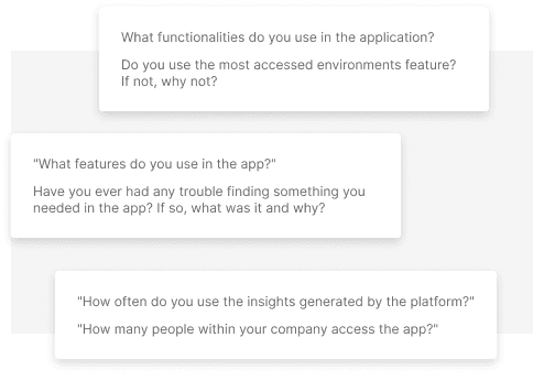
A questionnaire was conducted with the users aiming to understand the difficulties they face, identify the profile of the application users within the company, and their perspectives, considering that the user's viewpoint differs from that of the developers. Developers, or those indirectly involved in the development, carry biases that do not necessarily reflect the needs or perspectives of the user.
App usability test
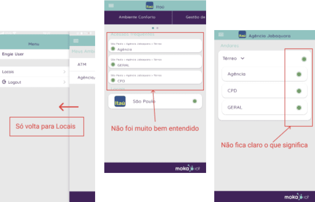
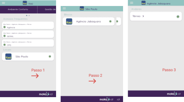
The goal was to understand the functioning of the application, its structure, identify issues for correction, and determine which information should be presented in the application. As a result, several points were identified:
It is necessary to follow the flow without the option to go back at every step, which makes the process time-consuming and involves too many clicks.
The purpose of the application and its functionalities are not clearly defined. Additionally, the meaning of each button is not clear, requiring the user to spend time discovering their functions.
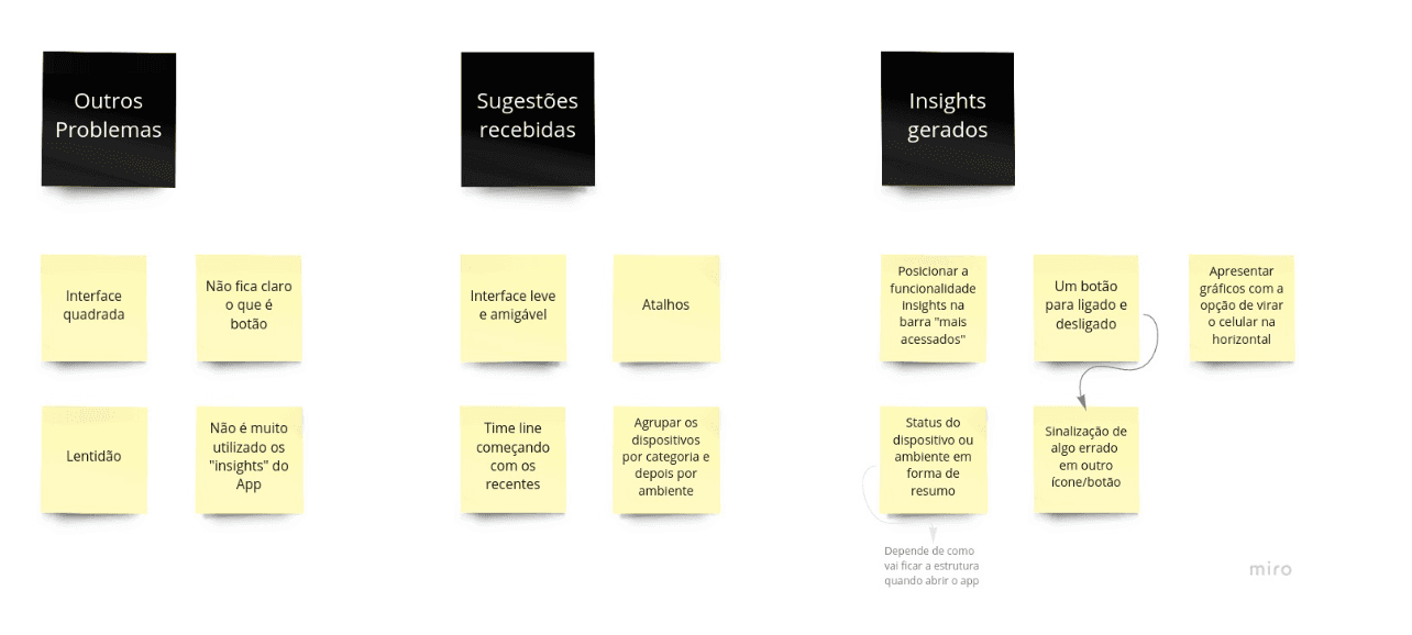
Affinity Mapping
The Affinity Mapping contains other issues raised and a grouping of suggestions and insights collected throughout the research, tests, and benchmarking
User journey
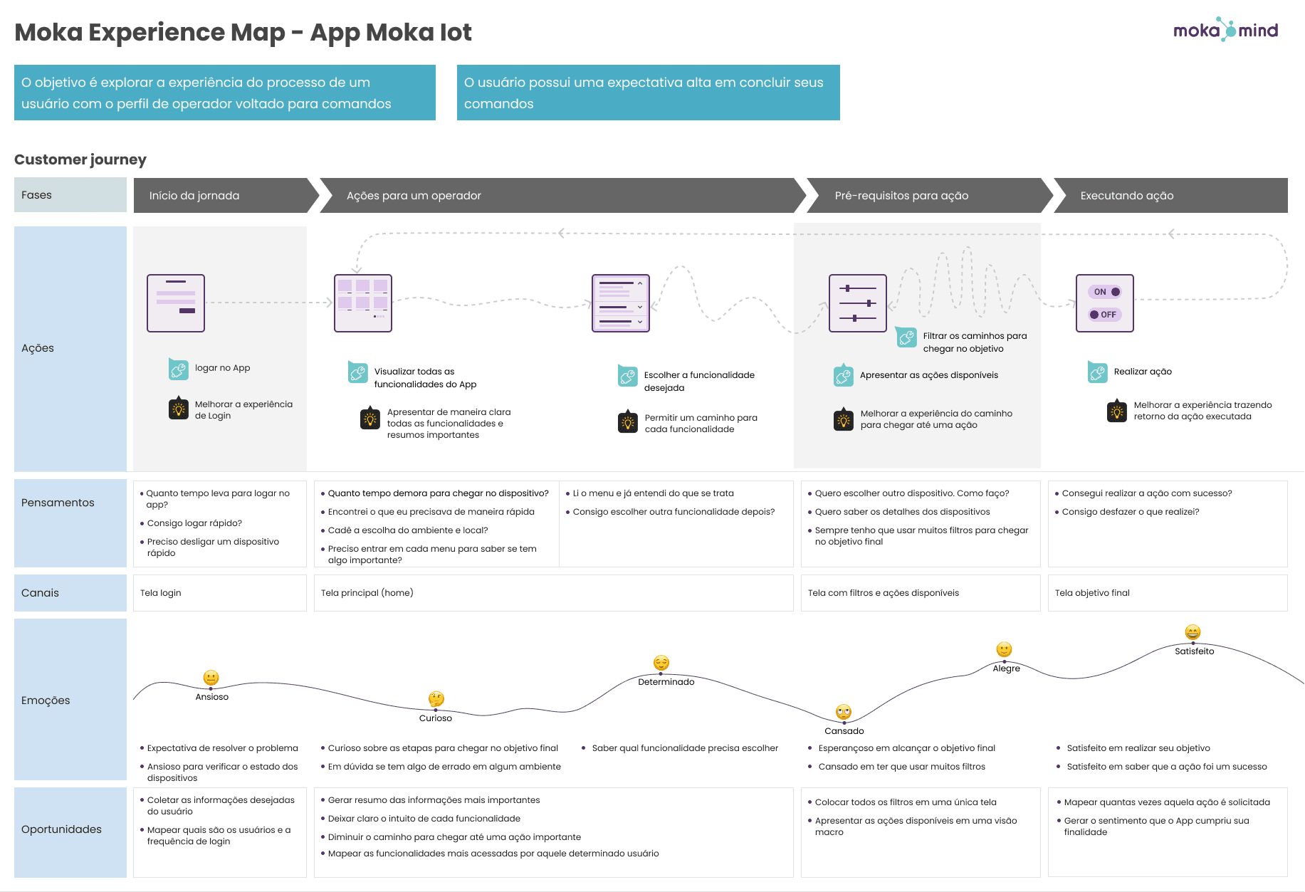
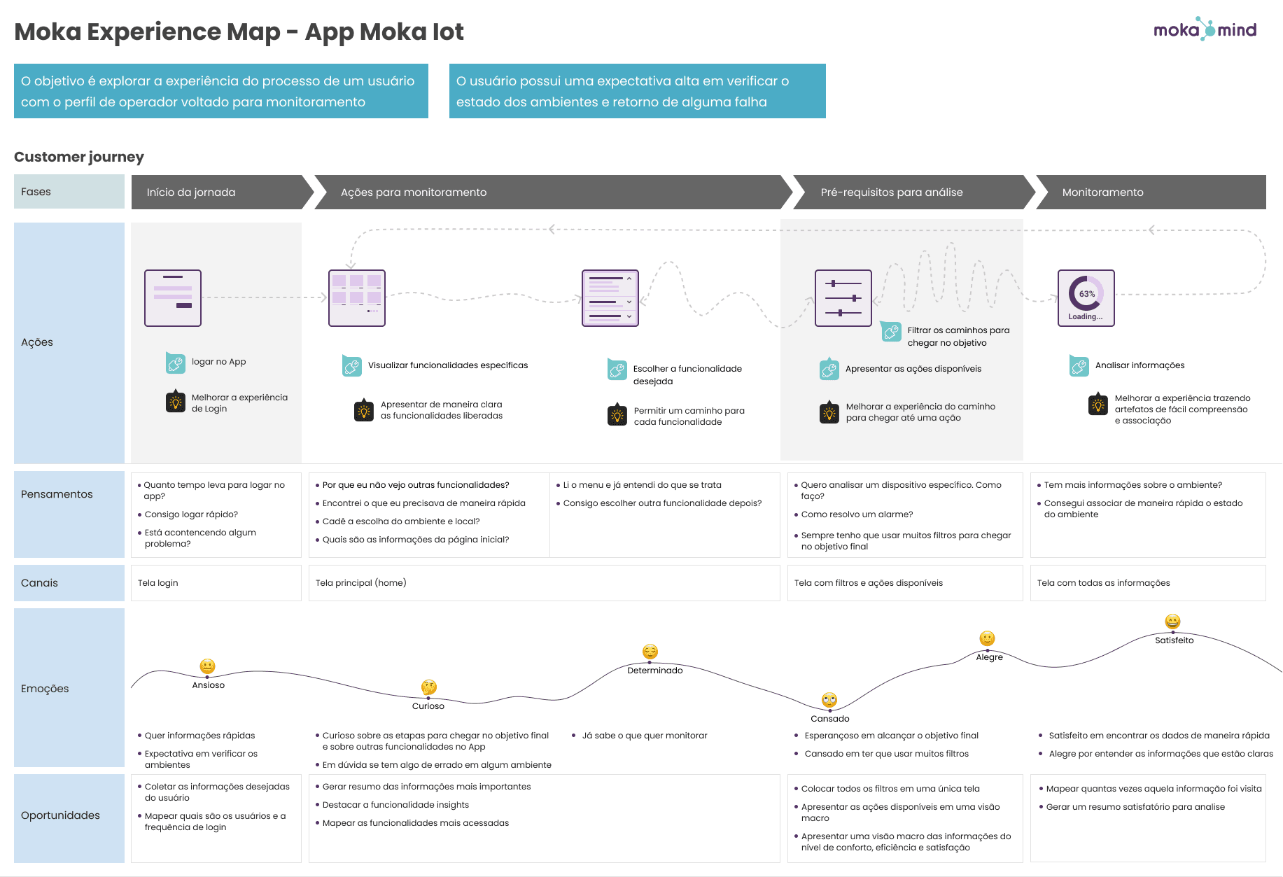
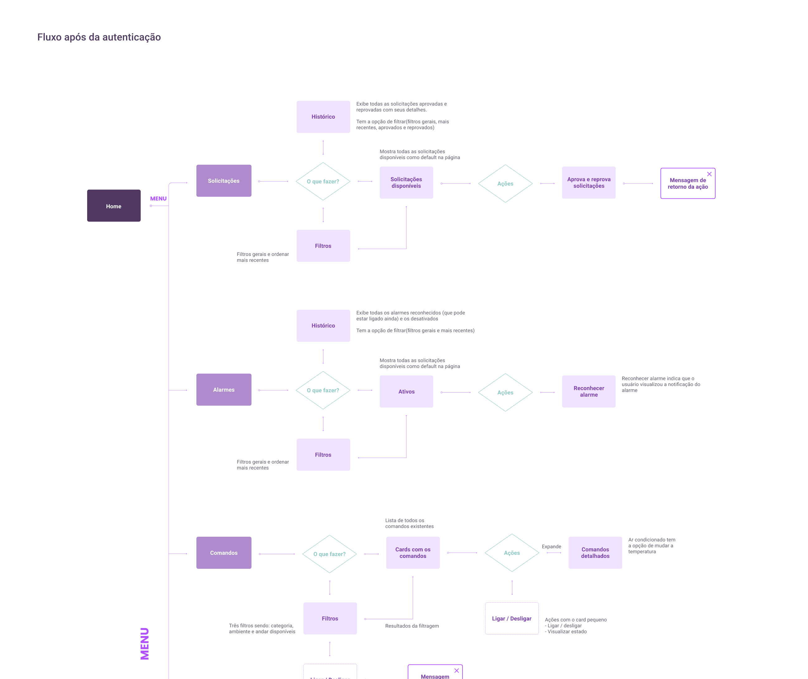
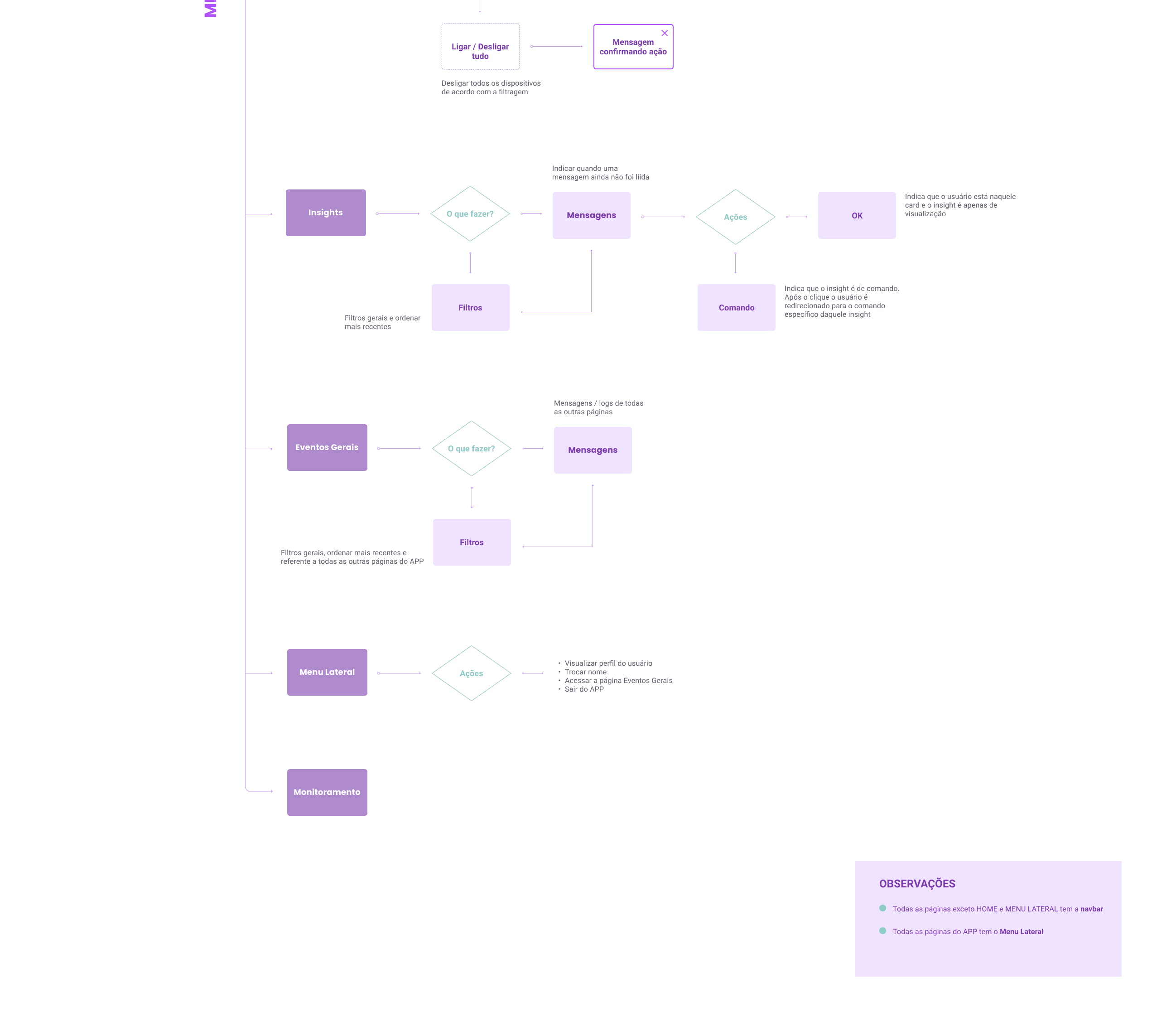
When designing the user journey, we identified two user profiles with distinct needs for artifact visualization, each playing a specific role within the application. At this stage, we had information about two personas for the same application: the operational manager, responsible for managing alerts and turning devices on/off, and the second persona, with a more analytical profile, tasked with monitoring the actions taken by persona 1, tracking triggered alarms, and approving/disapproving requests.
This visualization allowed us to create a more precise user flow for the application, ensuring that the artifacts presented were essential for each profile.
Prototyping
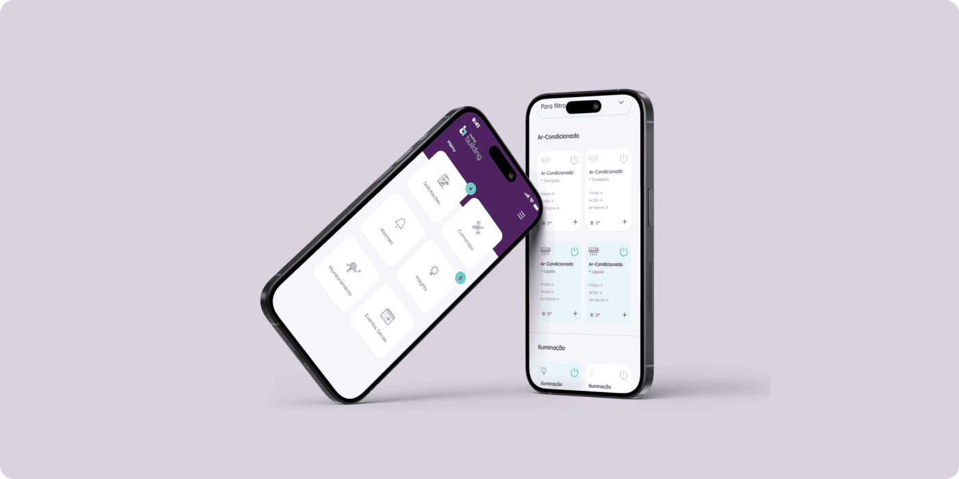
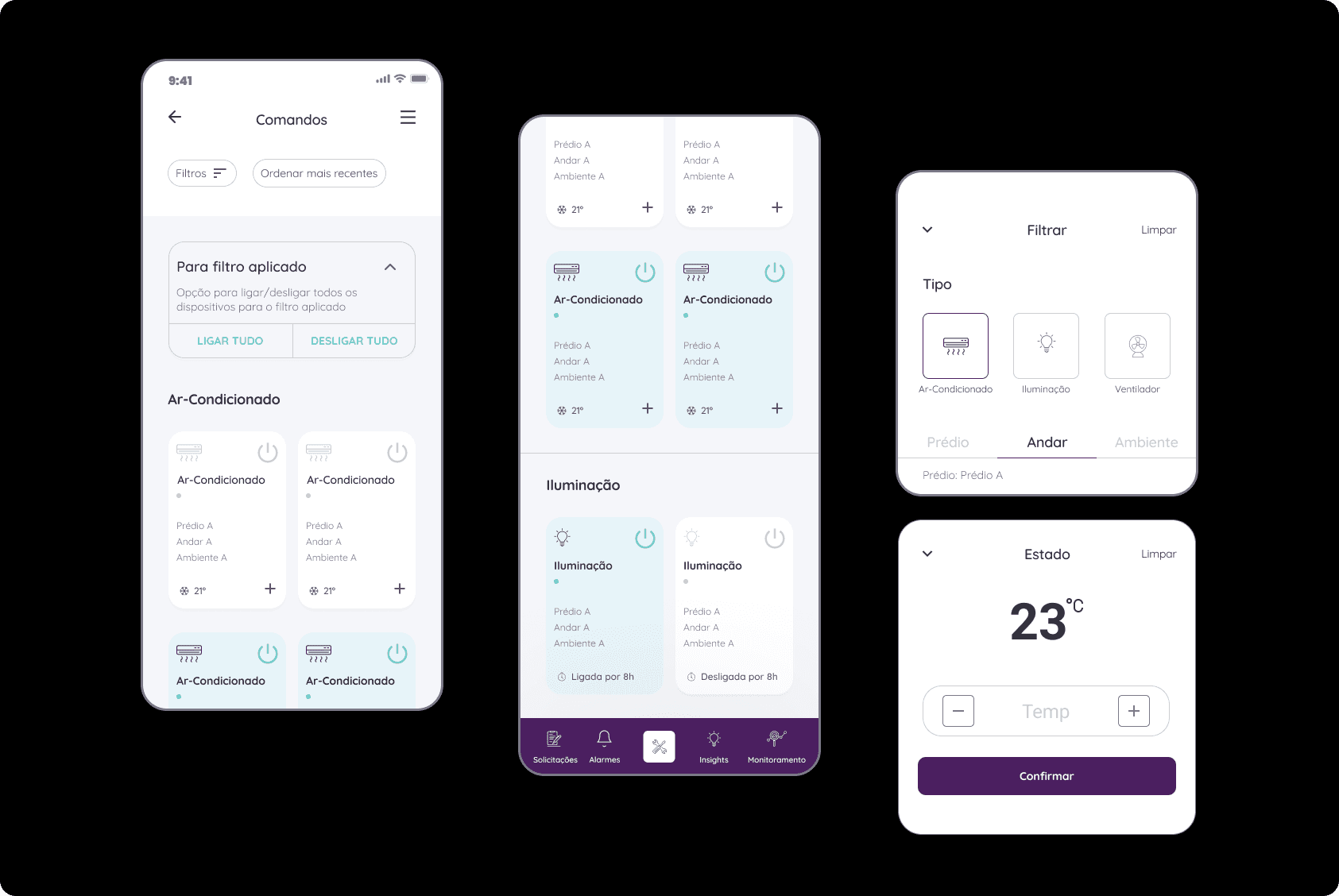
Now, it's possible to manage all devices on one screen. You can turn devices on or off with just one click and configure them with up to three clicks at most.
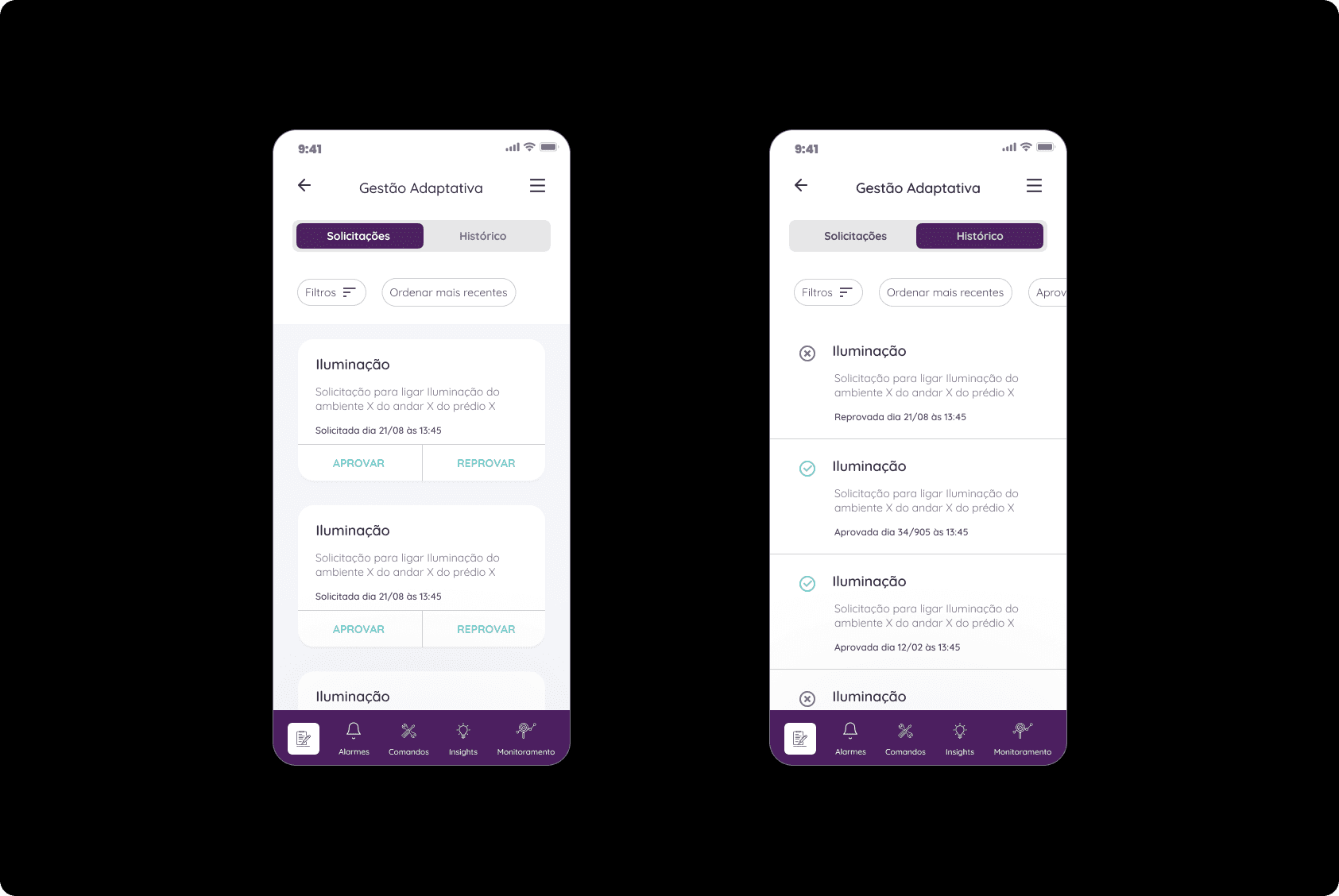
Visibility of pending requests, history, and above all, the recording of the moment when each action occurred.
Ease of access to all application functionalities, with filters to locate sectors in just a few clicks, along with the option to save for quick access in future uses.
